
Card design: the new Wallet format in iOS 27
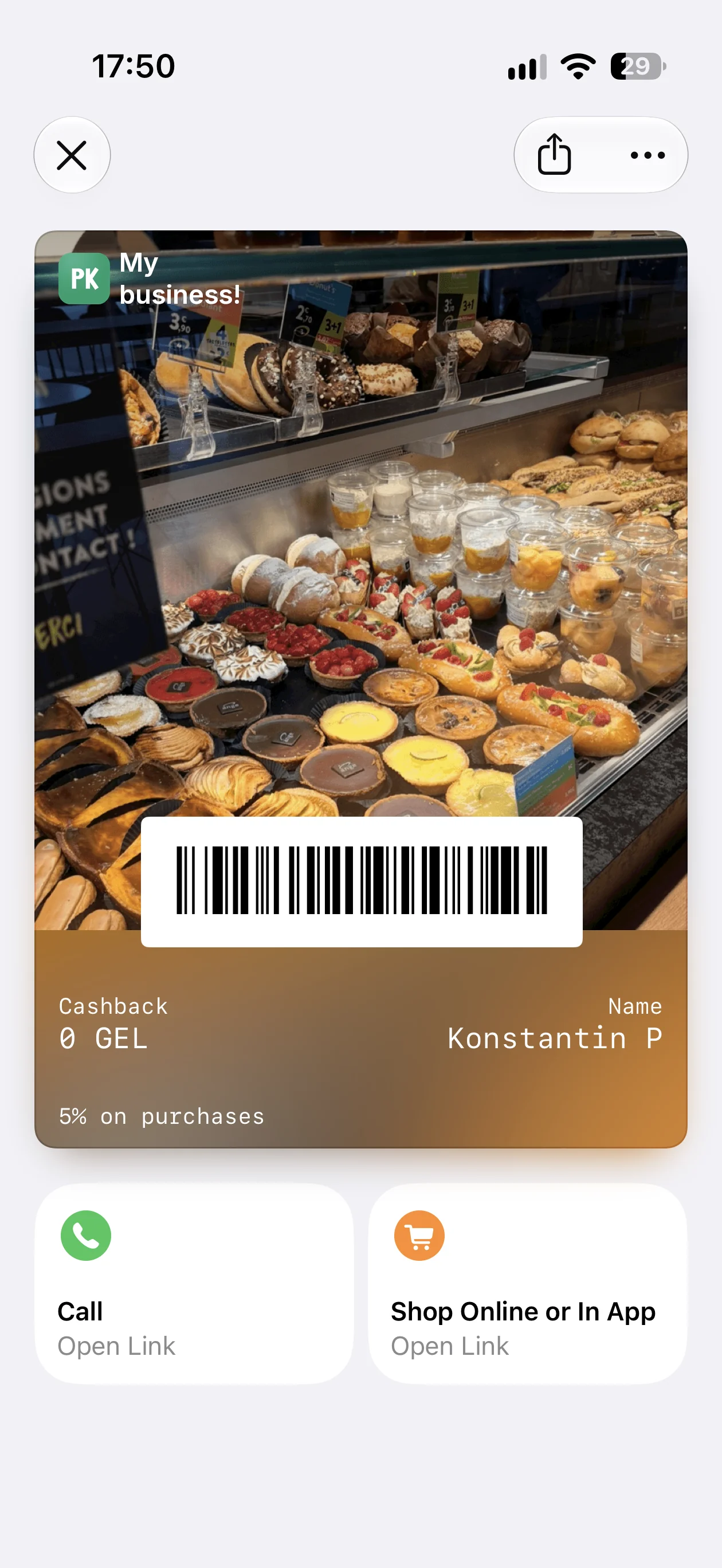
iOS 27 introduces a new look for loyalty cards: a poster with a large background image. In Pikarta, you can prepare both views of one card, classic and poster, customize colors, and add quick actions.
Version 1.7 of the mobile app will bring posters for Apple Wallet on iOS 27, ready-made color themes, and quick actions on your card. Make the design your own, from the background image to call and shop buttons. On iOS below 27 and Android, the card will keep its classic look.
The screenshots show the app in English.
What changes in iOS 27
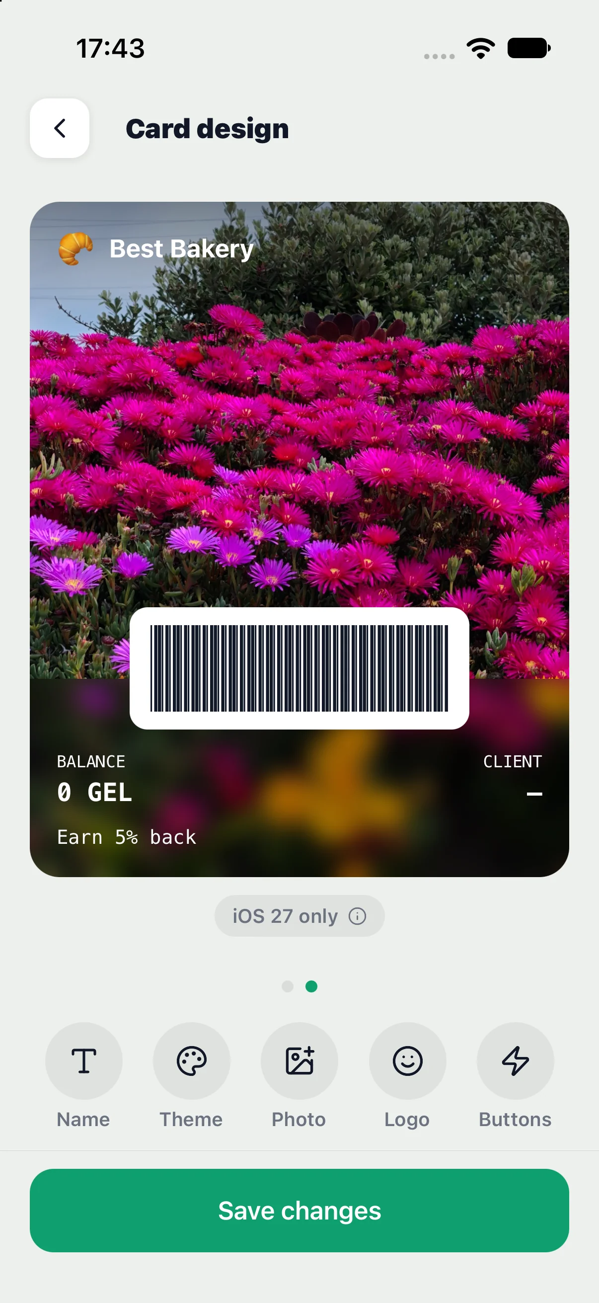
The poster puts your photo or brand artwork at the center of the design. The header keeps your logo and business name; the lower area shows the balance, cardholder name, and reward description. The barcode remains part of the card.
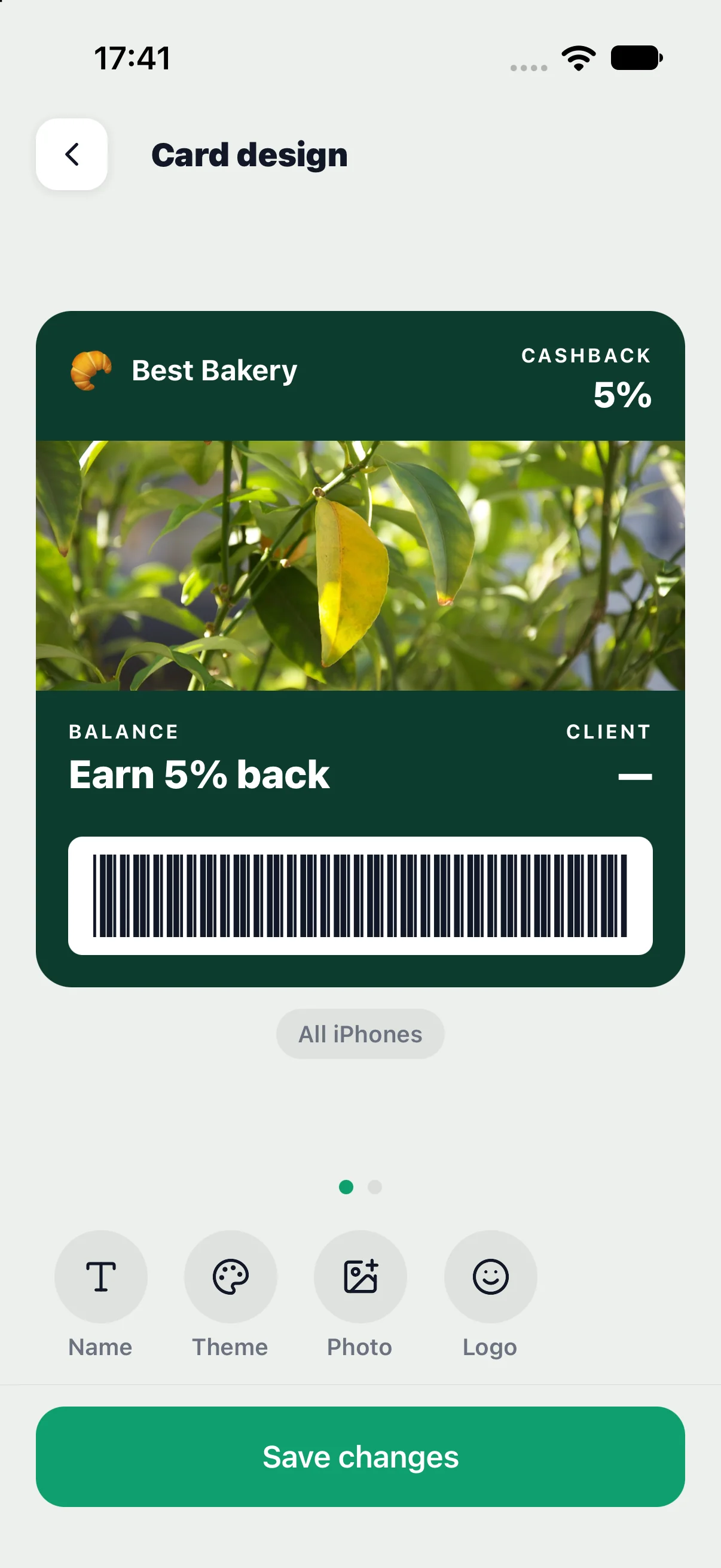
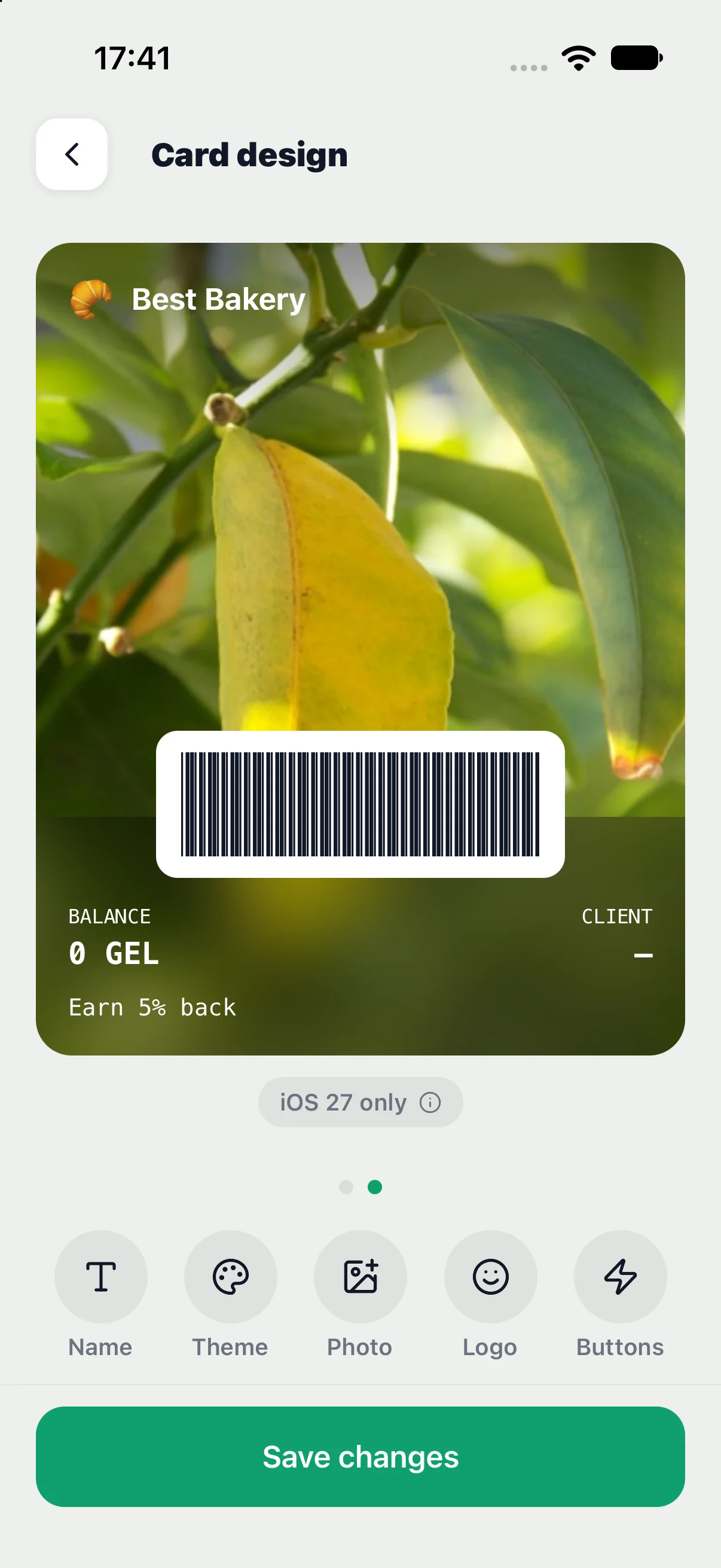
Two views of one card
Open Card Design and swipe horizontally between the classic card and poster previews. The iOS 27 badge below the poster explains compatibility. Devices running iOS versions below 27 and Android use the classic view, so prepare both designs.
Card name
Enter your business name: it appears in the header beside the logo. A name is required to save the card. Keep it short and recognizable, and check it in both previews.
Background, text, and label colors
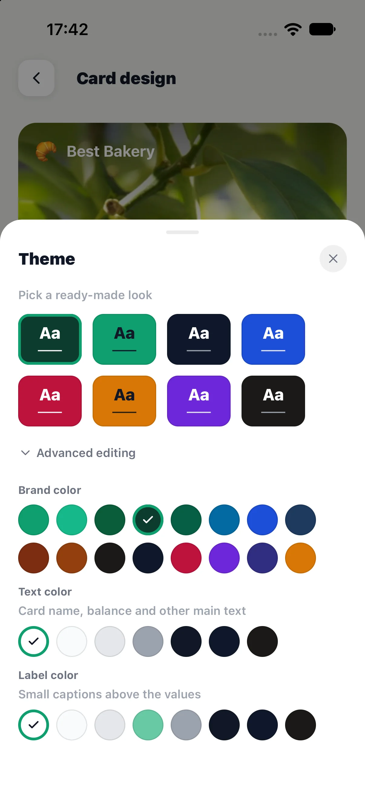
Theme settings let you choose the brand color, main text color, and label color separately. If a low-contrast warning appears, adjust the colors or background image. Check that the balance, name, and labels are readable over your photo.
Logo
Choose an emoji or upload a logo. A square PNG with a transparent background, preferably at least 256 × 256 pixels, works well. Check that the logo and name are clear in both the classic card and poster headers.
Classic banner
On the classic card page, upload a horizontal banner. The in-app crop helps you prepare an image with an aspect ratio of about 2.6:1. This design also serves customers on iOS 26 and earlier. Without a banner, the card uses your brand color.
Poster image
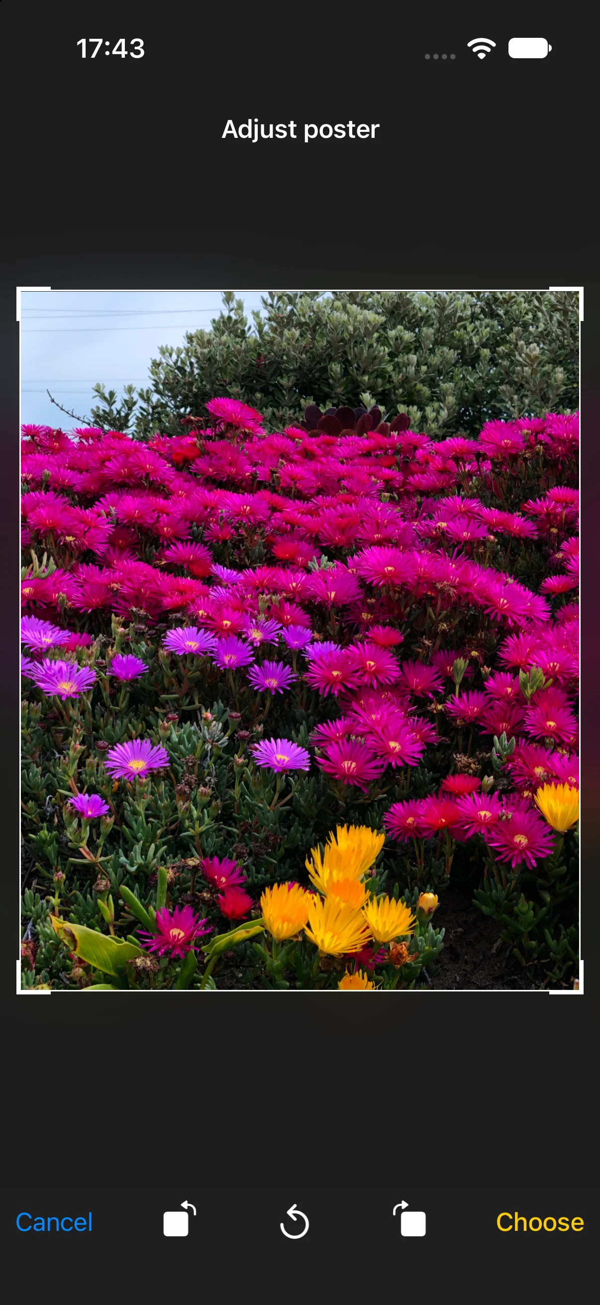
On the poster page, upload a separate portrait image and adjust the crop. If no poster image is set, the banner is used; if neither is set, the brand color is used. A horizontal banner may be heavily cropped, so a separate photo gives you more control.
Keep the lower area uncluttered: Wallet places card information there. Do not embed balances, program terms, or barcodes in the image; use the dedicated fields.
Quick actions
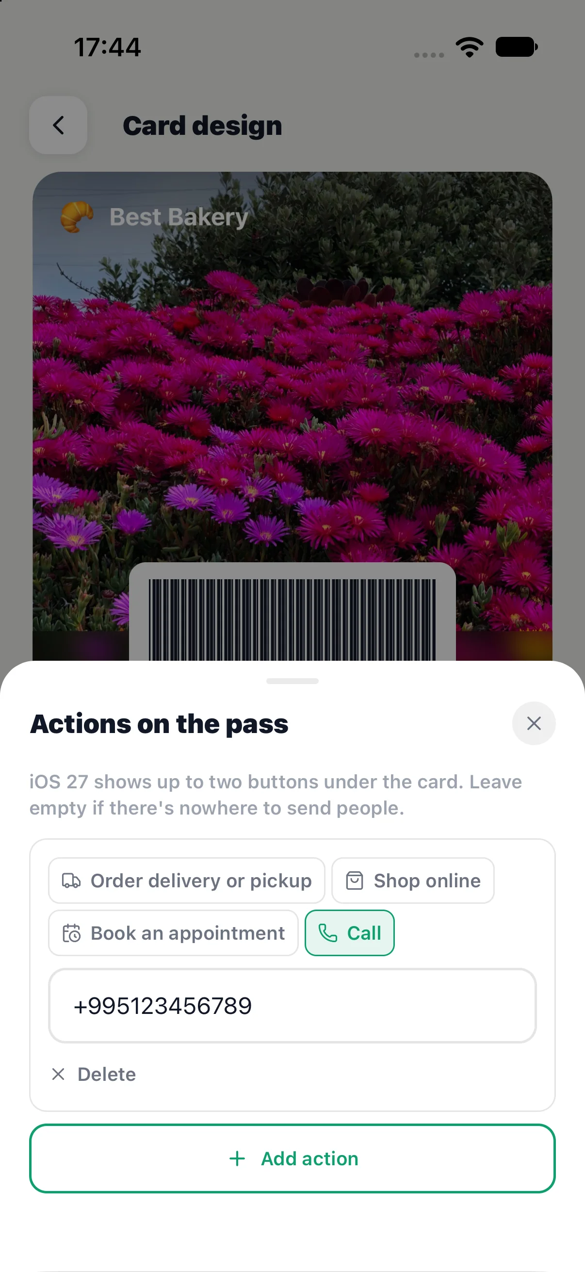
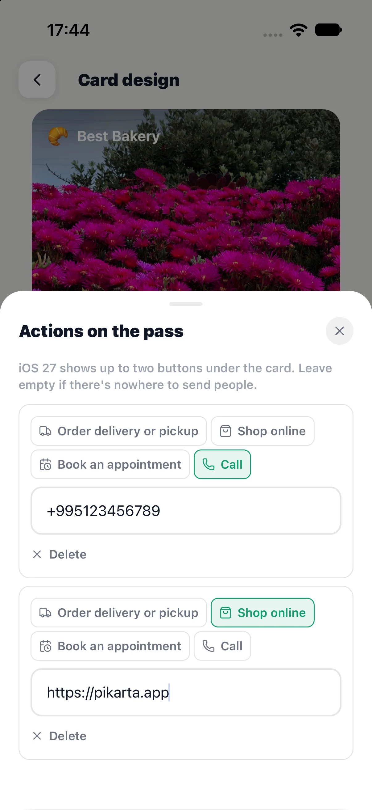
Open the actions tool on the poster page. Add up to two buttons: order, shop, book an appointment, or call. Enter an HTTPS link for the first three, or a phone number for calls. Wallet supplies the button labels and icons.
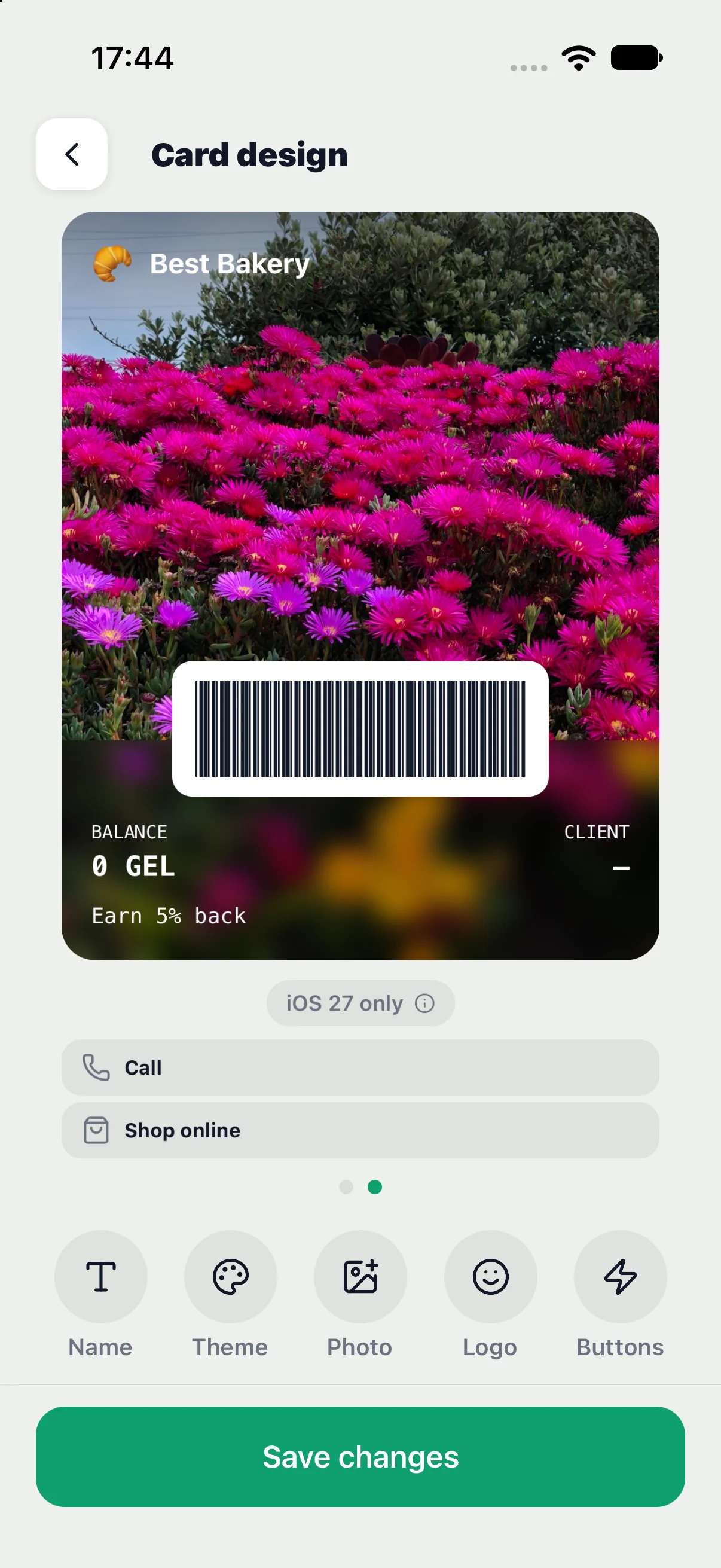
On iOS 27, actions appear below the card. These buttons are unavailable on earlier iOS versions.
Check and save
Before saving, review both previews: background, name, balance, labels, and image crop. The preview helps you assess the design; check the final layout in Wallet itself.
Saving starts an update for cards already issued. Delivery depends on device connectivity and Wallet, so changes may take time to appear. Open the card on an iPhone after saving to check the result.
Previous version of this article
Instructions for the previous card editor, kept for reference. Some settings and behavior may differ from version 1.7.
Card Design
Every customer sees your card in Wallet — make it recognisable. You can change the name, color, logo, and banner at any time. All customers' cards will update automatically.
The "Card Design" screen in the app settings
Card name
The name appears at the top of the customer's Wallet card. Typically this is your business name.
Tips for the name:
Brand color
The color is the main background of the Wallet card. Choose from the provided palette a color that is associated with your brand.
Logo
The logo appears in the upper-left corner of the card next to the name. There are two options:
Recommendations for the uploaded logo: minimum 256×256 px, PNG with transparent background, square format.
Banner
The banner is a background image that replaces the solid brand color. It occupies the upper part of the Wallet card and makes it visually rich and memorable.
The banner is great for promotional purposes:
Technical requirements
Preview
At the top of the "Card Design" screen there is always a live preview — exactly how the card will look to customers in Wallet. Use it to make sure the design looks right before saving.